 ChatGPT
 Claude
 Perplexity
 Gemini
 Grok
Key highlights
- UX design shapes the whole journey and whether a product solves the user's problem, while UI design shapes how each screen looks and behaves.
- Good UX starts with user research and low fidelity wireframes, long before colours and visual polish are chosen.
- Accessibility based on WCAG is a core quality requirement, and automated studies show most websites still fail basic checks.
- A design system with shared tokens and components keeps UI consistent and speeds up both design and development.
- Small, frequent usability tests with real users find problems early and are the most reliable way to improve conversions.
A business owner asks for a better looking app when the real problem is that customers cannot find the pricing page. A product team spends weeks polishing colours and animations, yet sign ups stay flat. Both situations come from the same confusion. Understanding UI vs UX design helps you spend design budget on the problems that actually hold your product back.
In short, UI is what people see and touch, and UX is the whole experience of trying to get something done. A beautiful interface cannot rescue a confusing journey, and a well planned journey still fails if buttons are hard to read or forms break on mobile.
This guide explains the key differences and then walks through the practices that make modern applications work: user research, wireframes, accessibility based on WCAG, design systems, usability testing, responsive design and the link between design and business conversions.
UX design decides what a product should do and how the journey should flow, based on research into users' goals and problems. UI design decides how each screen looks and behaves, including layout, typography, colour, components and interaction states. Successful products need both: UX makes them useful and easy, and UI makes them clear, consistent and pleasant.
- UX: research, structure, flows and usability
- UI: visual design, components and interaction details
- Both: accessibility, testing and measurable outcomes
UI vs UX: what each term really means
Don Norman and Jakob Nielsen of Nielsen Norman Group define user experience as encompassing all aspects of the end user's interaction with the company, its services and its products. They stress that the total experience must be distinguished from the user interface. Their example is a film search interface that works perfectly but still delivers a poor experience if the database lacks the films people are looking for.
UI design is the visible and interactive layer: buttons, forms, typography, colour, spacing, icons, motion and the many states a screen can be in, such as loading, empty, error and success. It is a crucial part of UX, but only one part.
Job titles vary as well. Some companies hire separate UX researchers, UX designers and UI designers, while many startups hire one product designer who covers all of it. For a business owner, the title matters less than whether research, structure, visual design and testing all actually happen.
A simple way to remember it: UX asks whether the product solves the right problem in the right order, and UI asks whether each step is clear, consistent and easy to act on.
| Aspect | UX design | UI design |
|---|---|---|
| Core question | Does this solve the user's problem easily? | Is each screen clear, consistent and appealing? |
| Main activities | Research, journeys, information architecture, wireframes, testing | Visual design, components, typography, colour, interaction states |
| Typical deliverables | Personas, user flows, wireframes, prototypes, research reports | High fidelity mockups, style guides, component libraries |
| Success measures | Task success, time on task, drop off, satisfaction | Readability, consistency, visual clarity, accessibility |
| When it leads | Early discovery and planning | Detailed design and handoff to developers |
User research: the foundation of good UX
Good UX starts with understanding who your users are, what they are trying to achieve and what gets in their way. Without this, design decisions are guesses, however polished they look.
Research does not have to be expensive. Talk to a handful of real or potential customers, review analytics to see where people drop off, read support tickets and chat transcripts, and observe someone using a competitor's product. If you are planning a new product, our guide on how to build an MVP explains how to fold this research into a lean first release.
- What task is the user trying to complete, and why now?
- What do they use today, and what frustrates them about it?
- On which device and in what context will they use your product?
- What would make them trust you enough to sign up or pay?
- What words do they use to describe the problem?
Questions that customers ask again and again usually point to unclear navigation, missing information or confusing labels. Tag recurring support and chat questions for a month and you will have a prioritized list of UX problems.
Information architecture and wireframes
Information architecture is how content and features are organized and labelled. It decides what goes in the main navigation, how settings are grouped and what a user sees first after logging in. Card sorting, where users group topics in a way that makes sense to them, is a quick way to test your structure.
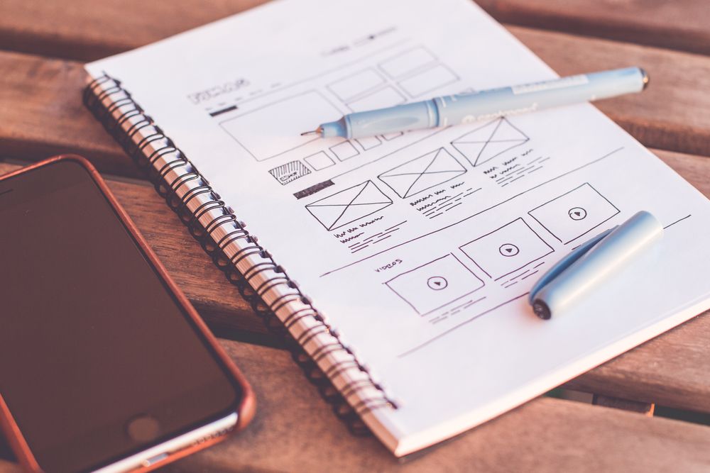
Wireframes are low fidelity layouts that show structure and priority without colour or styling. Because they are quick to change, they let teams debate flows and content before anyone invests in visual polish. The next step is a clickable prototype that connects screens so you can test the journey with real people.
A common mistake is to skip straight to high fidelity mockups. Stakeholders then comment on colours and fonts while missing structural problems that are far more expensive to fix after development starts.
UI design best practices: clarity, hierarchy and consistency
Once the structure is right, UI design makes it easy to use at a glance. Jakob Nielsen's 10 usability heuristics, first developed in 1990 and refined in 1994, remain a practical checklist. They include visibility of system status, consistency and standards, error prevention and recognition rather than recall.
- Give each screen one clear primary action and make it visually dominant
- Use a consistent type scale, spacing system and colour palette
- Design every state: loading, empty, error, success and partial data
- Show feedback immediately after actions such as saving or paying
- Write short, specific labels and error messages that explain how to fix the problem
- Reuse familiar patterns instead of inventing new controls for common tasks
Accessibility and WCAG: design for everyone
Accessibility means people with visual, motor, hearing or cognitive disabilities can use your product. The Web Content Accessibility Guidelines are the main international standard. According to the W3C, WCAG 2.2 was published on 5 October 2023 with an update on 12 December 2024. It is organized under four principles, perceivable, operable, understandable and robust, with success criteria at three levels: A, AA and AAA. W3C encourages using the latest version.
Most of the web still falls short. The WebAIM Million 2026 report found automatically detectable WCAG 2 failures on 95.9% of the top one million home pages, with an average of 56.1 errors per page. Low contrast text appeared on 83.9% of home pages, and images without alt text on 53.1%.
- Give normal text a contrast ratio of at least 4.5:1 for level AA
- Make pointer targets at least 24 by 24 CSS pixels, or give smaller ones enough spacing, as WCAG 2.2 requires at level AA
- Label every form field and connect error messages to the right input
- Write meaningful alt text for informative images
- Ensure every feature works with a keyboard and shows a visible focus indicator
- Never use colour alone to convey meaning, such as red for errors
In the European Union, Directive (EU) 2019/882, known as the European Accessibility Act, applies to e-commerce services provided to consumers after 28 June 2025, with an exemption for microenterprises providing services. Other countries have their own rules, so check the requirements in the markets you serve. This is general information, not legal advice.
Design systems: consistency at scale
As a product grows, small inconsistencies multiply: five shades of blue, three button styles and forms that behave differently on every page. Nielsen Norman Group defines a design system as a complete set of standards intended to manage design at scale using reusable components and patterns. It typically includes a style guide, a component library and a pattern library.
The real value comes when design and code share the same foundations. Design tokens for colour, spacing and typography can live in both the design tool and the codebase, and each component in the design file matches a coded component in React or your mobile framework. Designers spend less time on pixel tweaks, and developers stop rebuilding the same button.
You do not need a large system on day one. In our experience, an early product benefits most from a small set of tokens and a few well built core components such as buttons, inputs, modals and tables, which the team then grows as real needs appear.
Usability testing: watch real people use it
Nothing replaces watching a real person try to complete a task. In a widely cited Nielsen Norman Group article, Jakob Nielsen explains that a first study with five participants found 85% of the usability problems in his analysis, and recommends running several small rounds rather than one large study. He also notes the guidance applies to comparable users, so distinct user groups need their own participants, and quantitative studies need larger samples.
- 1
Choose realistic tasks
Pick three to five tasks that matter to the business, such as signing up, booking an appointment or finding a price.
- 2
Recruit representative users
Find people who match your audience. Colleagues and friends know too much about your product to give honest results.
- 3
Run short moderated sessions
Ask participants to think aloud while they work, and resist the urge to help or explain.
- 4
Log issues by severity
Note where people hesitate, make errors or give up, then rank issues by how often they occur and how much they block progress.
- 5
Fix, then test again
Address the biggest problems and run another small round to confirm the fixes work and did not create new issues.
Responsive design for every screen
Users switch between phones, tablets and laptops, often in the same day. Responsive design adapts layouts to each screen instead of shrinking a desktop page. The web.dev guide to responsive design starts with the viewport meta tag using width=device-width, then builds on flexible layouts, responsive images and media queries.
Good responsive design is about priorities, not just sizes. Decide what matters most on a small screen, keep primary actions within easy reach, use the right input types so phones show number or email keyboards, and test on real devices and slow connections. If you are deciding between platforms, our comparison of web apps and mobile apps covers the trade offs.
How UI and UX design drive business conversions
Conversions are the actions that matter to your business: sign ups, purchases, bookings or demo requests. UX removes friction from the path to those actions, while UI makes the next step obvious and trustworthy.
- State the value of your product clearly on the first screen
- Keep forms short and ask only for information you need now
- Show pricing, delivery times and policies before people have to ask
- Offer guest checkout or social sign in where it fits your product
- Validate form fields inline and explain errors in plain language
- Keep pages fast, because slow screens break even good journeys
Trust is part of conversion too. Clear contact details, honest pricing, real customer reviews where you have them, visible security cues at payment and consistent, professional UI all reduce the doubt that makes people leave just before they commit.
Measure before and after each change. Funnel analytics show where people drop off, session recordings and usability tests explain why, and A/B tests can confirm improvements when you have enough traffic.
You will see case studies claiming large conversion gains from redesigns. These results are specific to each product, audience and starting point, so treat them as examples rather than predictions. The only reliable number is the one you measure in your own funnel.
Conclusion: great products need both UI and UX
UI vs UX design is not a contest. UX makes sure you are building the right thing in the right order, and UI makes every step clear, consistent and accessible. Ground decisions in research, sketch before you polish, follow WCAG, build a lean design system, test with real users and measure the results. If you want a team that handles research, design and development together, contact Brahmabyte Lab for a free first consultation and let us help you create an application your customers find easy to use.
Frequently asked questions
UX design focuses on the overall experience: whether the product meets user needs and how easy the journey is from start to finish. UI design focuses on the interface itself, including layout, typography, colour, components and interactions. UX decides what should happen and in what order, while UI decides how it looks and feels on screen.
Yes, many designers, especially in startups and small teams, handle both. Larger organizations often split the roles so specialists can go deeper into research or visual design. What matters most is that both sets of activities happen, whoever does them.
UX work usually comes first, because research, user flows and wireframes define what each screen must do. UI design then turns those structures into polished, consistent screens. In practice the two overlap and inform each other throughout a project.
WCAG is the Web Content Accessibility Guidelines published by the W3C. It has three conformance levels: A, AA and AAA. Many organizations and regulations use level AA as the target, and W3C encourages using the latest version of WCAG.
For qualitative testing, Nielsen Norman Group's well known guidance is that small rounds of about five comparable users uncover most usability problems, and several small rounds beat one large study. Distinct user groups need their own participants, and quantitative studies need larger samples.
Design improvements often help by removing friction and making the next step clear, but there is no guaranteed percentage uplift. Results depend on your product, audience, traffic and how well changes are implemented. Measure your funnel before and after changes to see the real effect.
Sources and references
- The Definition of User Experience (UX), Nielsen Norman Group
- Why You Only Need to Test with 5 Users, Nielsen Norman Group
- WCAG 2 Overview, W3C Web Accessibility Initiative
- The WebAIM Million, WebAIM
Cover photo by picjumbo.com
Stay in the loop
Get our latest guides on software, SaaS and growth delivered to your inbox.
By subscribing, you agree to get updates from Brahmabyte Lab. You can unsubscribe any time. Brahmabyte Lab TeamEngineers, designers and writers at Brahmabyte Lab Back to blog